Ingredient transparency through dynamic dish presentation and a schematic menu
Timeline
3 months
Tools
Rhino, Illustrator, Woodshop, Pen & Paper, Kitchen
Methodologies
Rapid prototyping, usability testing, iterative models
Role
Architect/Product Designer
Because a typical restaurant experience is centered around these edible works of art, diners with dietary restrictions are scrutinized as their endless modification requests are often met with judgement and refusal.
In Oppos(eats), substitutions are not only welcome, but encouraged.
Timeline
3 months
Tools
Rhino, Illustrator, Woodshop, Pen & Paper, Kitchen
Methodologies
Rapid prototyping, usability testing, iterative models
Role
Architect/Product Designer
To obtain food transparency through:
A. Detailed schematic drawings expressing the process of cooking the meal and technically detailing the components, allowing for substitutions that don’t compromise the integrity of the dish
B. Visual presentation of meals & display of ingredients, creating a multisensorial experience with the ingredients (sight, taste, smell)
The menu has 2 main components:
1) the course overview with allergen specifications and notes for the chef
2) schematic details of each course item so that diners have 100% transparency about what is in their food.
To obtain food transparency through:
A. Detailed schematic drawings expressing the process of cooking the meal and technically detailing the components, allowing for substitutions that don’t compromise the integrity of the dish
B. Visual presentation of meals & display of ingredients, creating a multisensorial experience with the ingredients (sight, taste, smell)
Architecture and cooking are both creative processes that diverge in the nature of their procedures: architecture is schematic and logical, while cooking is free-flowing and multisensorial.
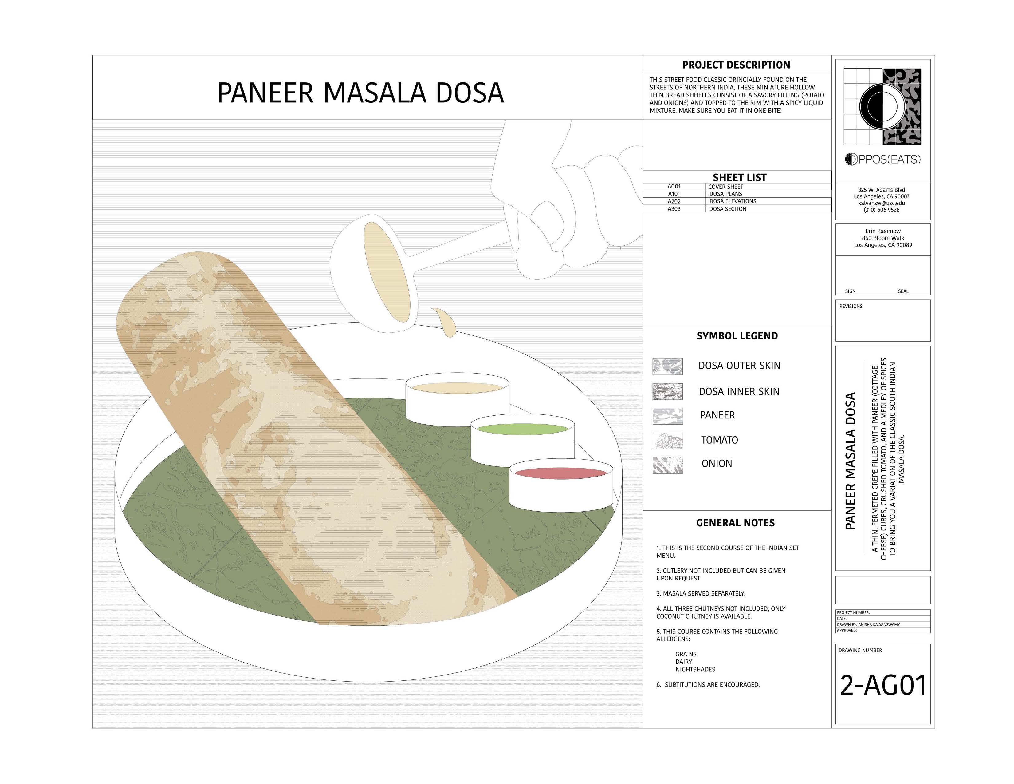
In architecture, construction drawings are a form of communication. They express the details and schematic design of a project, from materiality, dimensions, sometimes even building process. By applying this level of schematic detail to food, diners can access details about the creation of the dish and a micro level of detail about the ingredients.
Oppos(eats) is the culmination of both extremes in order to create a transparent relationship between chef and diner. Akin to an architect and client, “construction drawings” are used to communicate the multisensorial process and ingredients of each dish in a detailed, schematic manner.
A section not only articulates ingredient properties but communicates their respective taste profiles. Like a client would redline these drawings based on desired substitutions and modifications, diners can do the same for the dish they order.
The menu was inspired by Indian cuisine, the food I grew up with. Filled with spices and deep flavors, it is also a cuisine that doesn’t always leave a lot of room for substitutions.
Having many food allergies myself, I wanted to give diners the ability to experience the same taste sensations and palettes of original dishes but in an allergen-friendly way. Taste should not be compromised for the sake of convenience.
Presentation and service result in a role reversal between the two diners, in favor of the allergic diner. This was inspired based on my personal experiences, as someone with many food allergies, because it is nearly impossible to eat out at a restaurant.
In a time where food transparency is craved due to the hidden ingredients often found in food eaten outside, this set up is not limited to a diner with dietary restrictions.
The original premise of the meal, celebrating the diner with extremely modified meal from dietary restrictions, resulted in a spatial and presentation contrast from seating to meal presentation. The sacrifice on taste and original meal integrity is compensated through other multisensorial outlets.
Elaborate Dish Vessel
The meal is served in carved wooden blocks highlighting each ingredient along with a creative display of the course.
Spatial Dominance
On a table designed against a neutral grid, each dish occupies as little space as possible to make the other diner feel valued.
Standard Dish Vessel
While they contained the original dishes, were served in trays akin to a school cafeteria or Indian fast food canteen.
Minimal Space
On a table designed against a neutral grid, each dish fits into their half of the table, occupying the maximum capacity.
With extreme restriction comes true creativity. Minimal ingredients, maximum impact.
Library of drawings + redlines for three course menu